Onfitz E-Commerce Shopify Theme 2.O
Date Created: 19 July 2025
Version: 1.0.0
Author: bug-finder
Support: https://bugfinder.net/support-ticket
Special thanks for purchasing Onfitz.
If you have any questions about our theme or you find an issue, please feel free to send us a message to
After we received your email, Our Support staff will process and respond to your question in the queue order. Your question will be answered within 24 business working hours from the last email you sent to us. If you love our theme, please rate it. It’s the best award for our job we can get from you!
Installation
It's too easy to install Onfitz.
- Log in to your Shopify store.
- Navigate to Online Store.
- Go to Themes
- Click Add Theme Button and
- Choose Upload Zip File
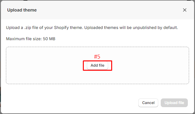
- Click Add File
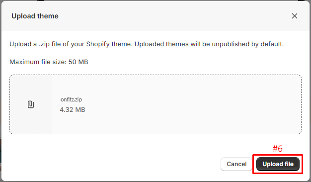
- After completing your purchase, unzip the file you receive. Inside, you’ll find a file named onfitz.zip. This is the theme file that you’ll need to upload to your Shopify store.
This should streamline the process and make it easy to follow.
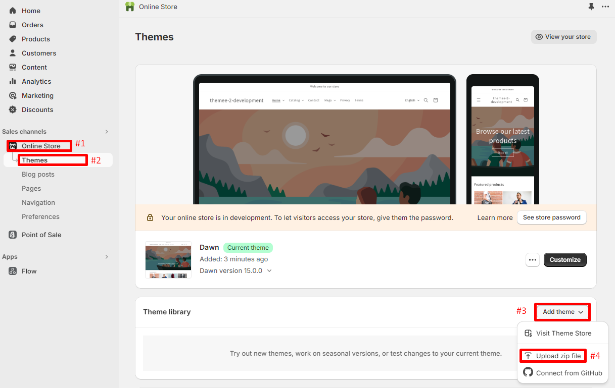
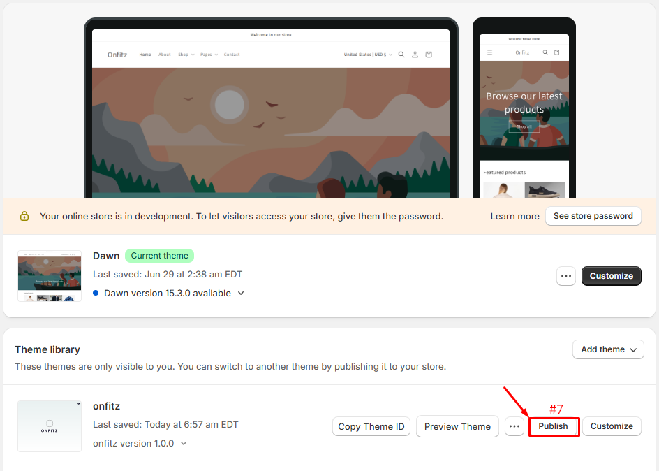
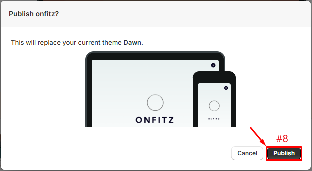
After installation a few second, it will appear in the righ area. Please click on Publish > to active new theme.
Shopify Knowlegae Base
Before we begin customizing your store, we would like to notice that this section will help you to have some collections and products added and a blog article written. So if you already had an active store and you are just updating your design, you don't need to read this part. Otherwise, here are some links to help you to setup your new store:
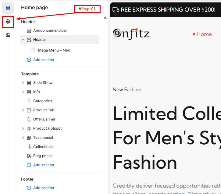
Theme Settings
Please log in to your Shopify Dashboard and go to Online Store> Themes > Customize > Theme Settings, these listing of options will appear in the Left area.
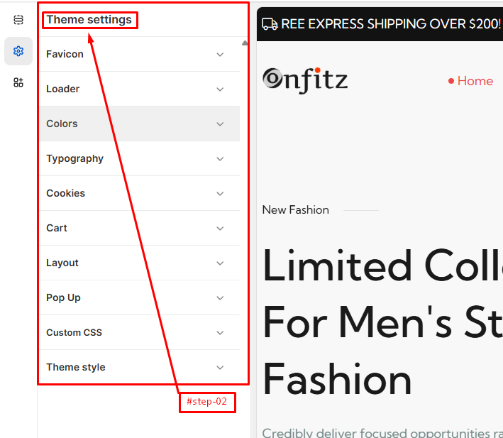
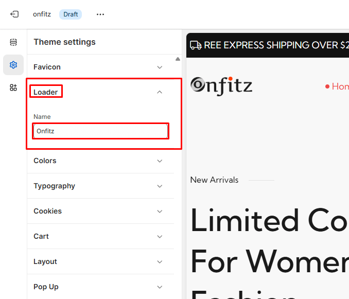
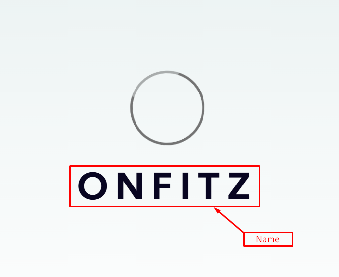
Preloader
Please log in to your Shopify Dashboard and go to Online Store> Themes > Customize > Theme Settings > Preloader, these listing of options will appear in the Left area.
- Select a GIF Image if you want.
- Right a Store Name
Color
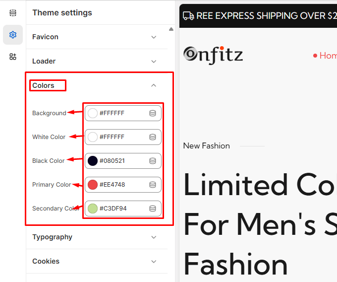
Please log in to your Shopify Dashboard and go to Online Store> Themes > Customize > Theme Settings > Color, these listing of options will appear in the Left area.
Color Schemes
- If you'd like to personalize the theme, feel free to adjust the color
Typography
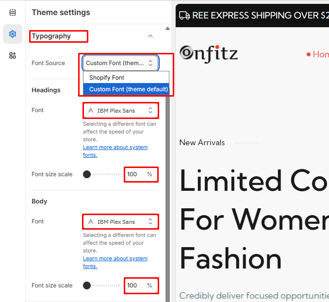
Please log in to your Shopify Dashboard and go to Online Store> Themes > Customize > Theme Settings > Typography, these listing of options will appear in the Left area.
Fonts Source
- Custom Font ( the default font already built into the theme manually)
- Shopify Font ( fonts selected from Shopify's built-in font picker)
Headings Fonts
- Font: This option allows you to choose the font for the headings in your store. The font displayed here is "Sans Serif" in the "Regular" style.
- Change: By clicking this button, you can select a different font from a list of available fonts.
Body Fonts
- Font: This option allows you to choose the font for the body text in your store. The font displayed here is also "Sans Serif" in the "Regular" style.
- Change: By clicking this button, you can select a different font for the body text.
Font Size Scale
- Slider: This slider allows you to adjust the font size scale for your store's text. It is currently set to 100%.
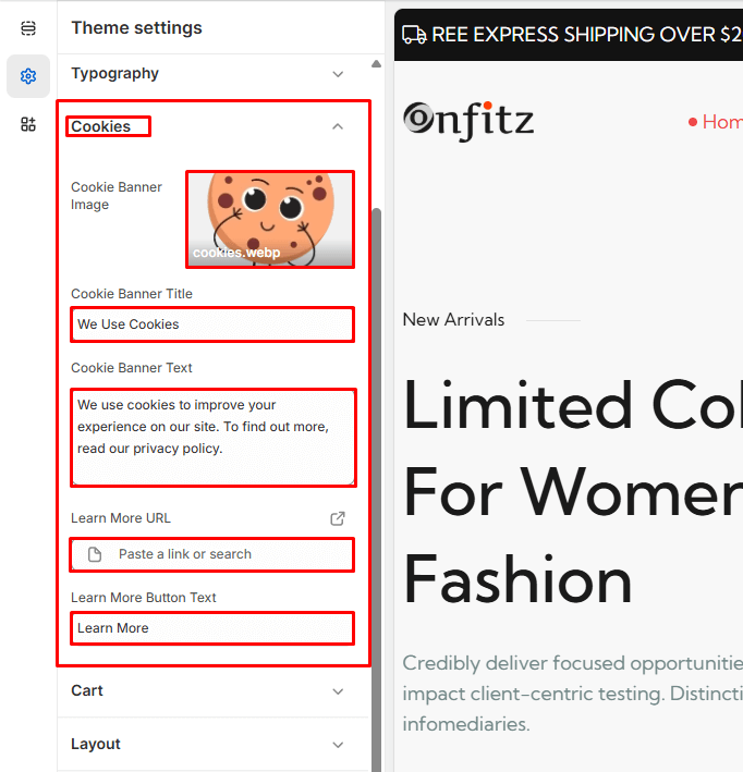
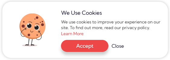
Cookies Bar
Please log in to your Shopify Dashboard and go to Online Store> Themes > Customize > Theme Settings > Cookies Bar, these listing of options will appear in the Left area.
- Select Image
- Title
- Description
- Button Label
- Button Link
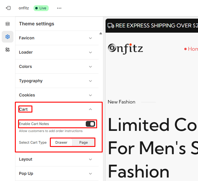
Cart
Please log in to your Shopify Dashboard and go to Online Store> Themes > Customize > Theme Settings > Cart, these listing of options will appear in the Left area.
Cart Notes
- Toggle this ON to allow customers to leave a note with their order.
- The note field will appear in the cart interface.
Cart Type
- Choose how the cart behaves when a product is added to the cart.
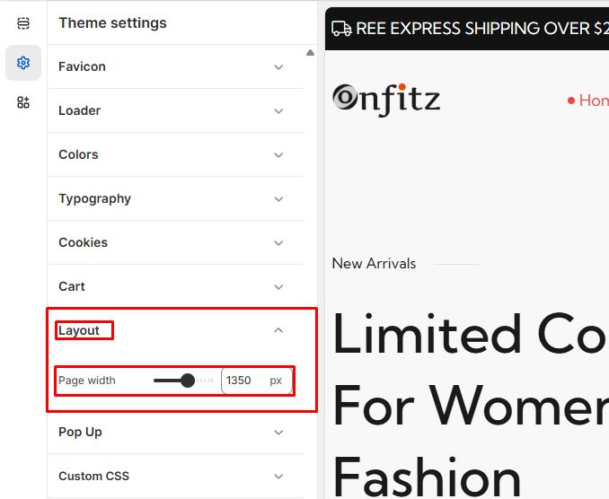
Layout
Please log in to your Shopify Dashboard and go to Online Store> Themes > Customize > Theme Settings > Layout, these listing of options will appear in the Left area.
Page Width
- This setting allows you to control the maximum width of the main content area of your storefront.
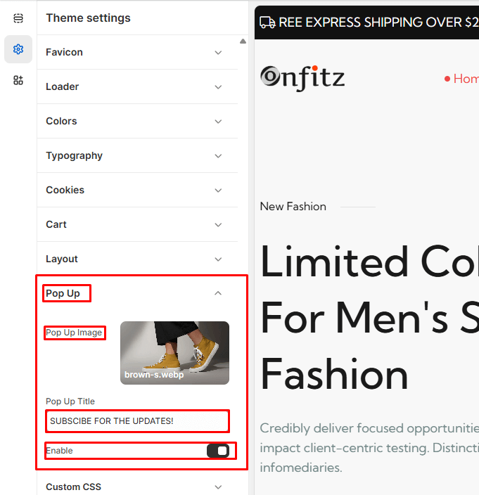
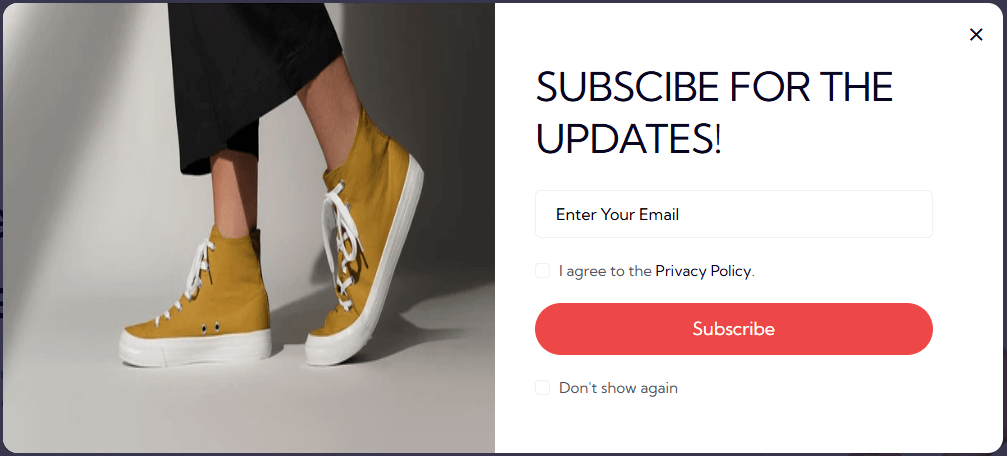
Pop up
Please log in to your Shopify Dashboard and go to Online Store> Themes > Customize > Theme Settings > Pop up, these listing of options will appear in the Left area.
- Select Image
- Title
- If you want to show the Pop up, simply toggle to show it. To hide it again, toggle back.
Announcement Bar

Header

Mega Menu
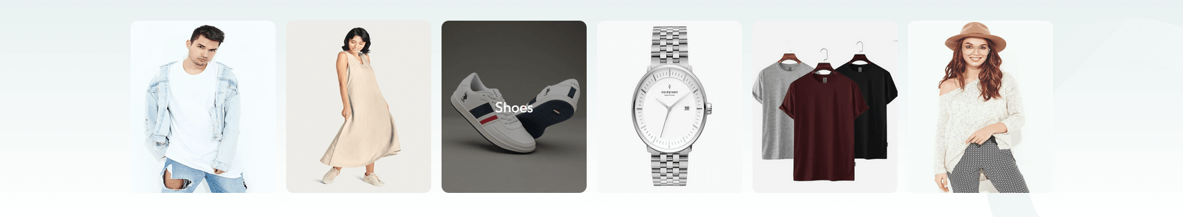
All our themes support mega-menu. Mega menus allow you to create rich menus with multi-columns and optional images.
Step 1: Creating the mega-menu
The second step involves creating a mega-menu:
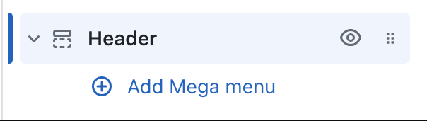
1. Open the theme editor, click on the "Header" section, and click on "Add mega-menu" button:
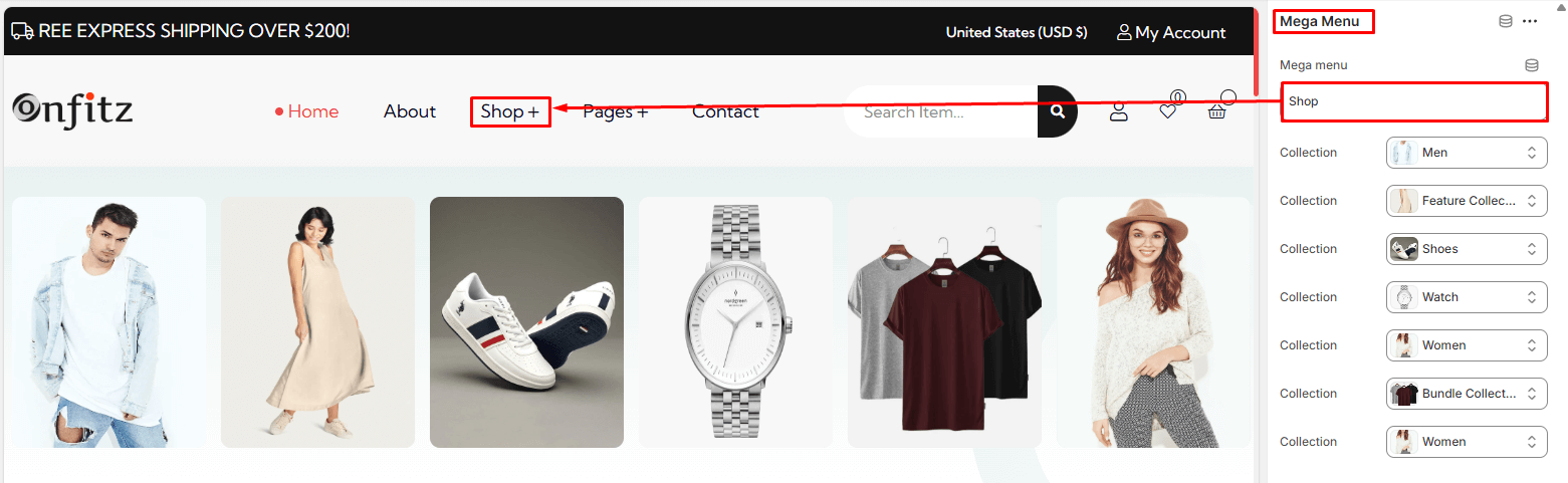
2. The most important setting to fill is the "Menu item" setting. It must match exactly the name of the first-level links you want to create a mega-menu.
Step 3: Configuring the mega-menu
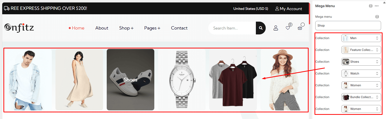
After adding the mega-menu block to your header, you can customize it by adding collections.
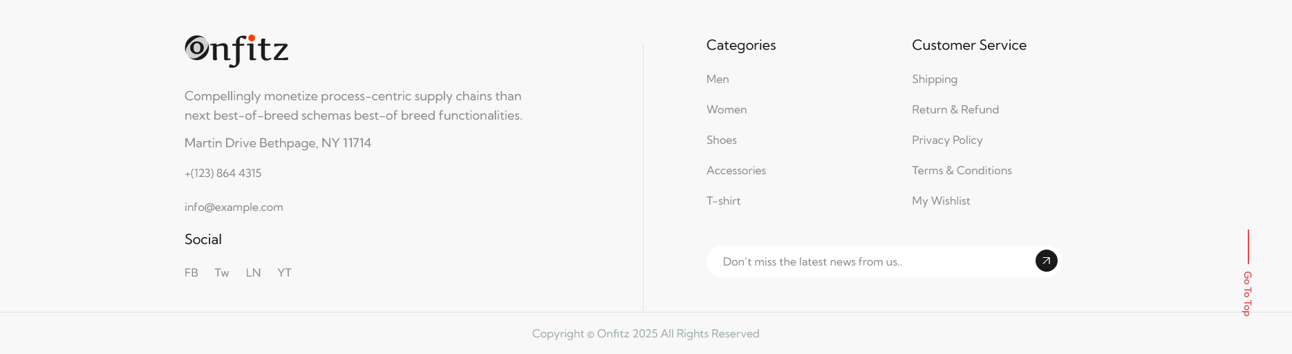
Footer
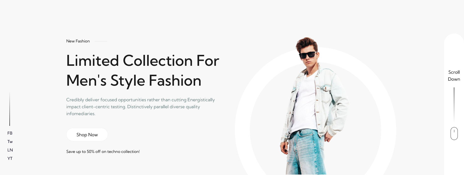
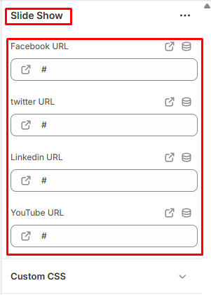
Slideshow
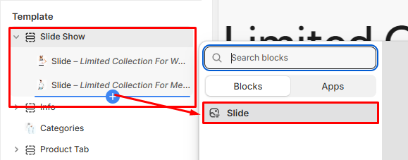
In Sections listing, select Slideshow
To add new, click to Add section > Slideshow
Under Slideshow Slider section will list options to control the Slide option, click or add slide to control:
Options for each Slideshow:
- Icons link Added
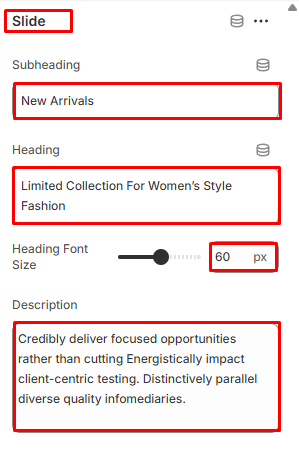
Options for Slideshow Slide:
- Subheading
- Heading
- Font Size
- Description
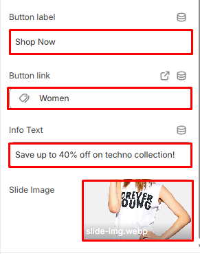
- Button Label
- Slider Image 1
Slideshow
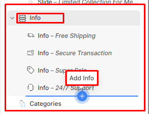
Info
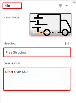
In Sections listing, select Info
To add new, click to Add section > Info
Under Info section will list options to control the Slide option, click or add slide to control:
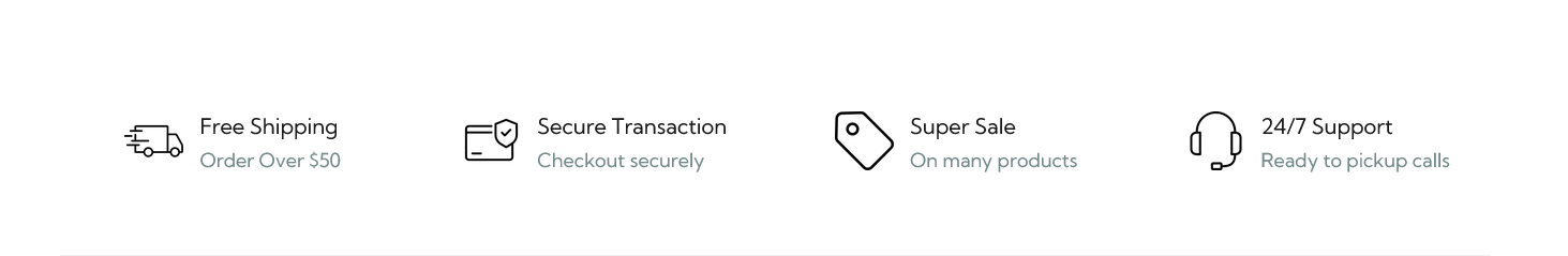
Options for each Info:
- Title
Options for Add Info:
- Select Image
- Info Heading
- Info Description
- Section Padding
Info
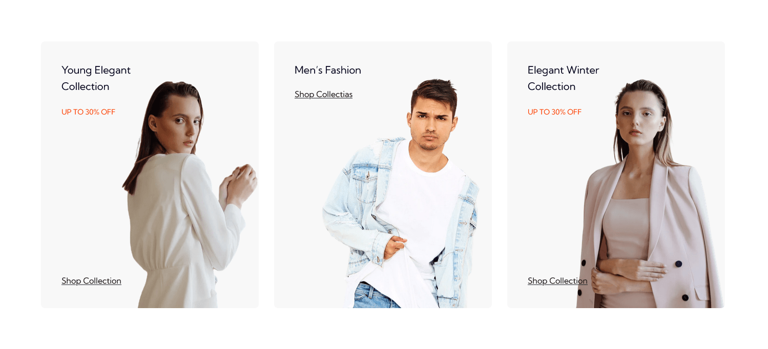
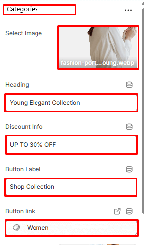
Categories
In Sections listing, select Categories
To add new, click to Add section > Categories
Options for each Categories:
- Heading
- Discount Info
- Button Label
- Button Link
Categories
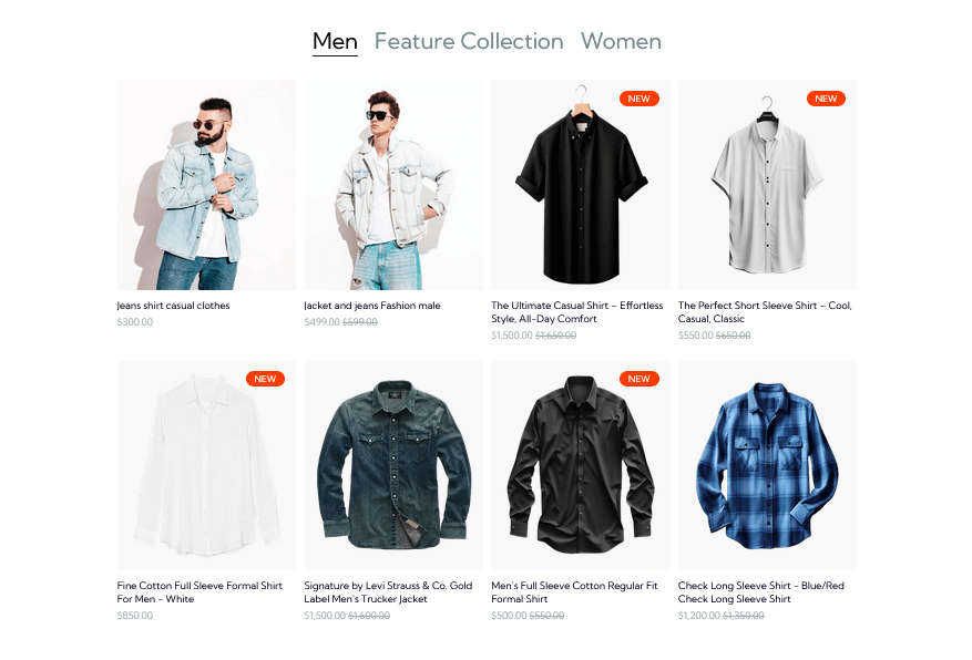
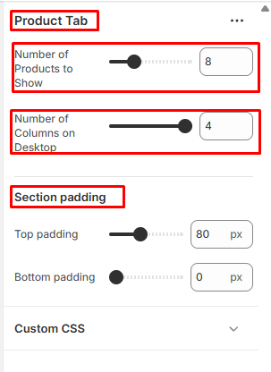
Product Tab
In Sections listing, select Product Tab
To add new, click to Add section > Product Tab
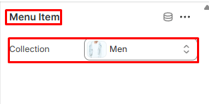
Under Product Tab section will list options to control the Menu Item option, click or add Menu Item to control:
Options for each Product Tab:
- Number of Products to Show
- Number of Columns on Desktop
- Section Padding
Options for each Menu Item:
- Select collection to show products
Product Tab
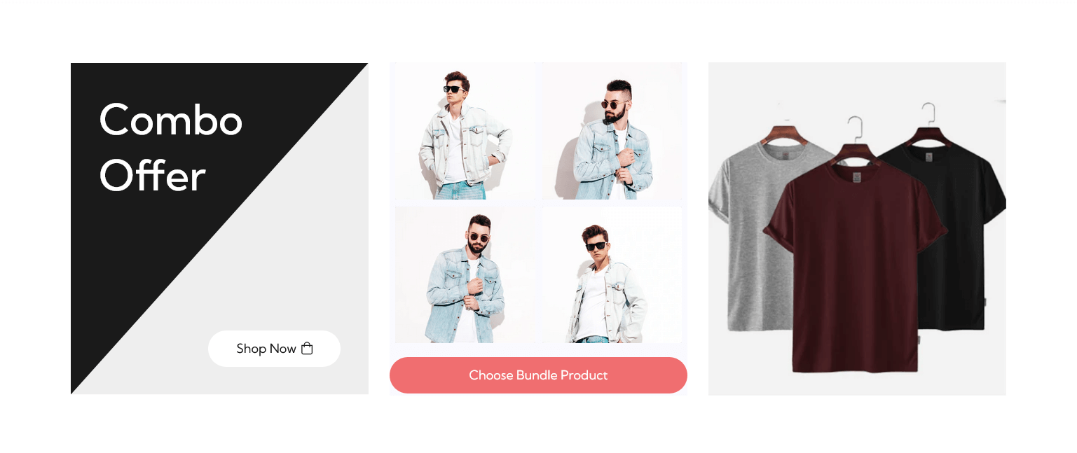
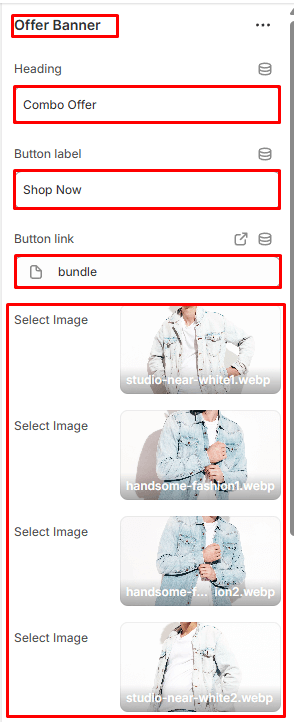
Offer Banner
In Sections listing, select Offer Banner
To add new, click to Add section > Offer Banner
Options for each Offer Banner:
- Heading
- Button Label
- Button Link
- Select Images
- Section Padding
Feature Collections
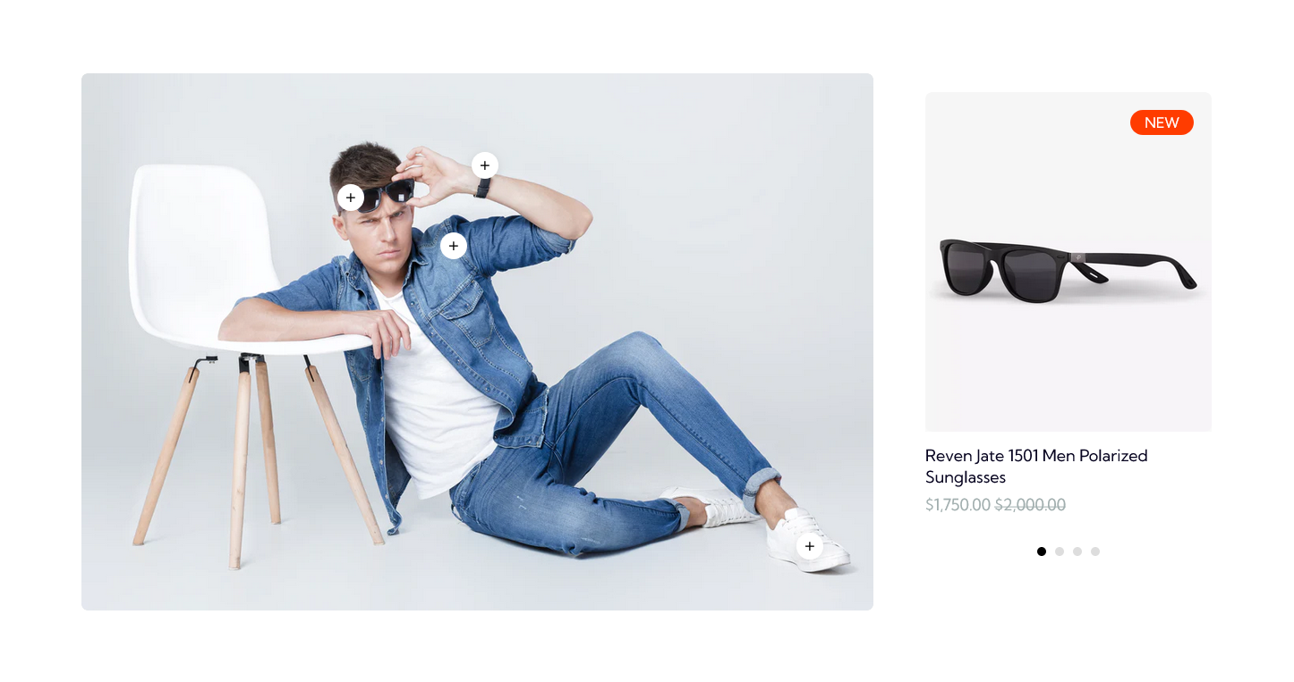
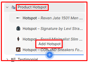
Product Hotspot
In Sections listing, select Product Hotspot
To add new, click to Add section > Product Hotspot
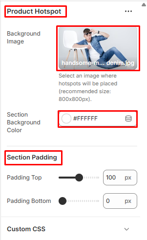
Options for each Product Hotspot:
- Select Background Image
- Select Background Color
- Section Padding
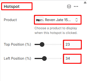
Options for each Add Hotspot:
- Select Hotspot Product
- Top & Bottom Position Hotspot Icon
Feature Collections
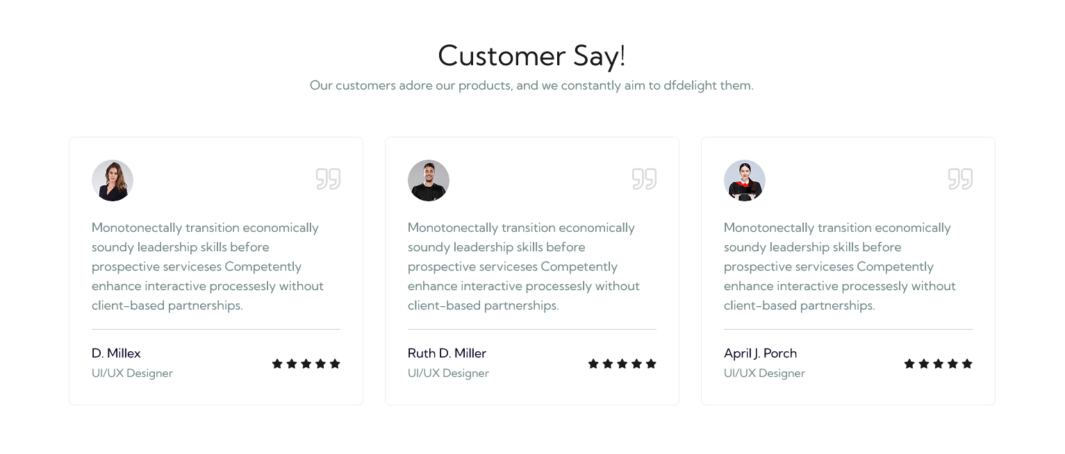
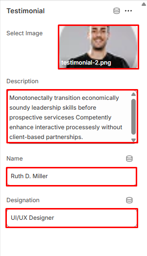
Testimonial
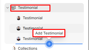
In Sections listing, select Testimonial
To add new, click to Add section > Testimonial
Under Testimonial Slider section will list options to control the Slide option, click or add slide to control:
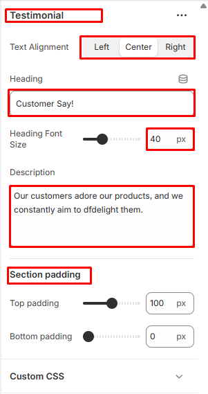
Options for each Testimonial:
- Text Alignment
- Heading
- Heading Font Size
- Description
- Section Padding
Options for Add Testimonial:
- Select Image
- Description
- Name
- Designation
Testimonial
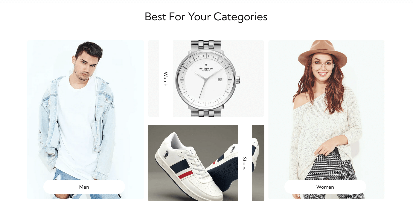
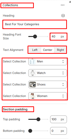
Collections
In Sections listing, select Collections
To add new, click to Add section > Collections
Options for each Collections:
- Heading
- Heading Font Size
- Text Alignment
- Select Collection
- Section Padding
Collections
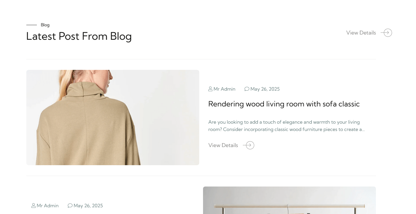
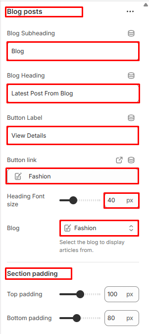
Blogs
In Sections listing, select Blogs
To add new, click to Add section > Blogs
Options for each Blogs:
- Blog Subheading
- Blog Heading
- Button Label
- Button Link
- Heading Font Size
- Select Blog
- Section Padding
Blogs
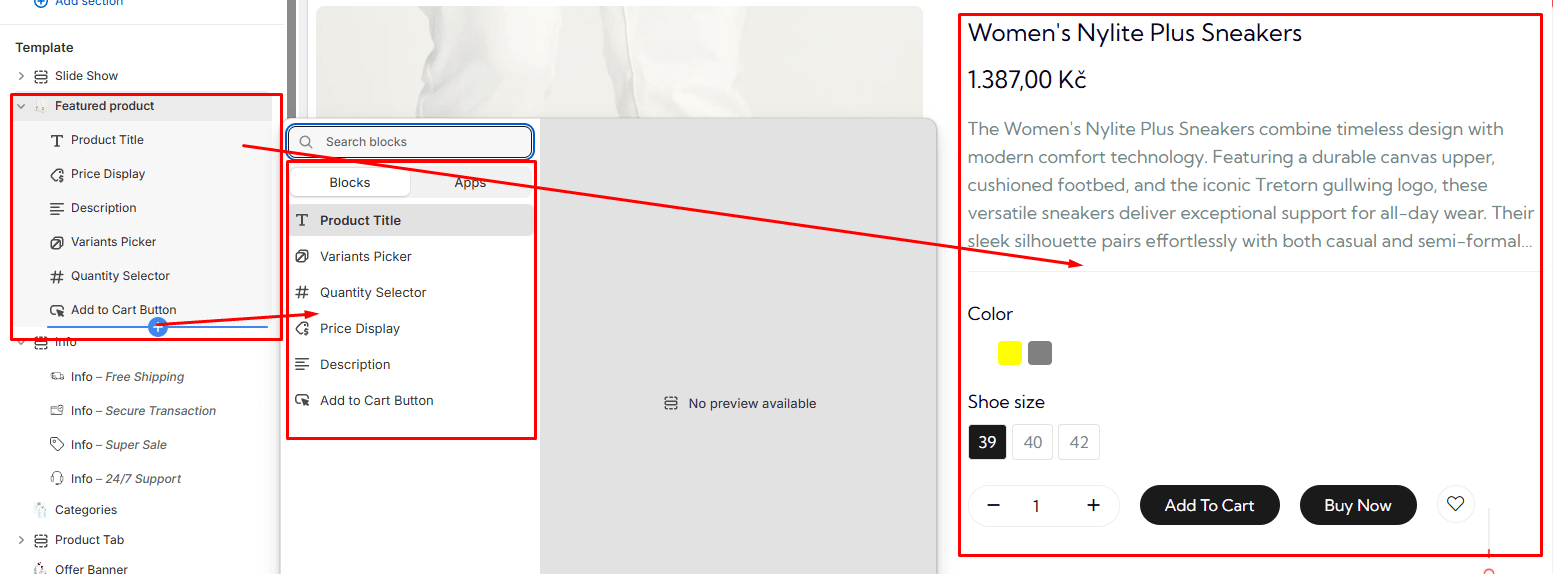
Feature Product
In Sections listing, select Feature Product
To add new, click to Add section > Feature Product
Under Featuer Product section will list options to control the Add Block option, click or add block to control:
Options for each Feature Product :
- Select Product to show Feature product
Options for each Feature Product Add Block:
- Product Title
- Product Price
- Product Description
- Product Variants Picker
- Product Quantity Selector
- Product Add to Cart Button
Product Tab
Feature Collections
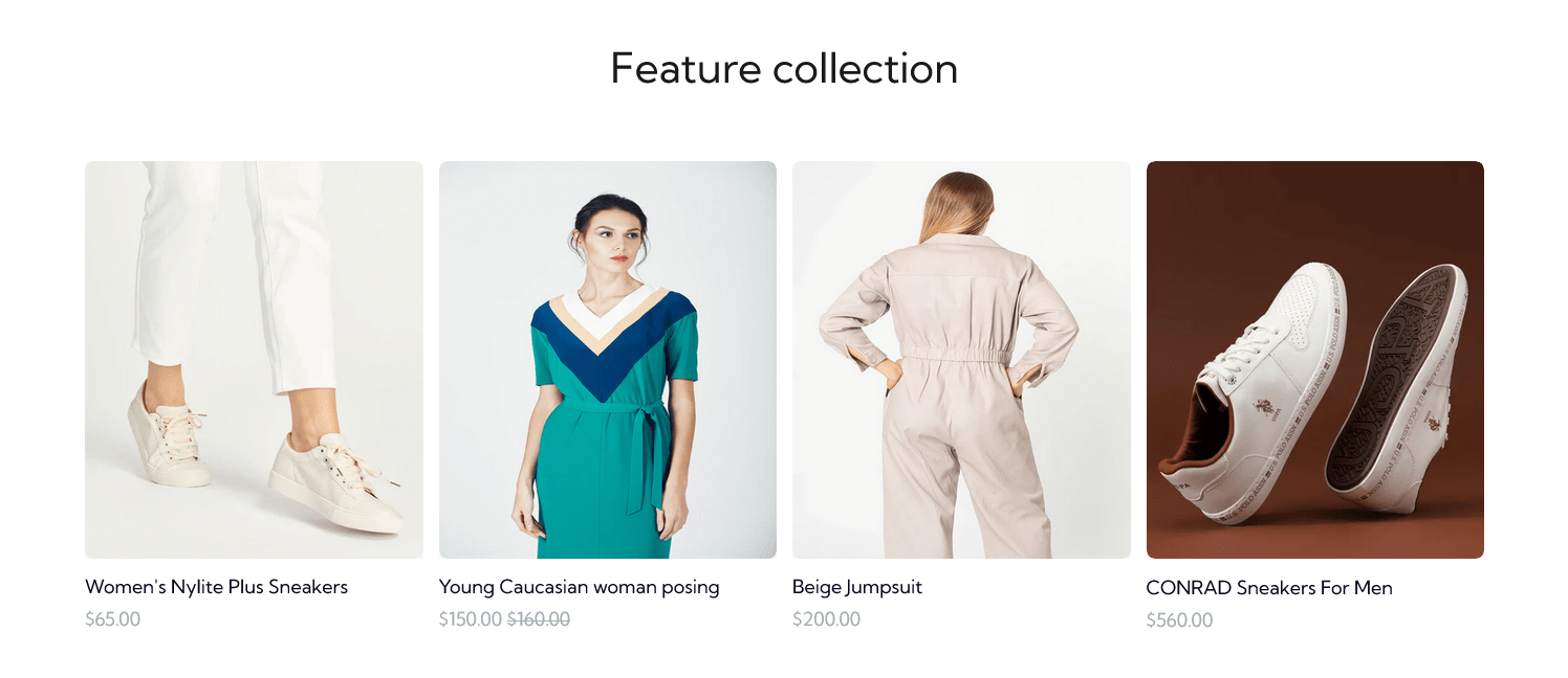
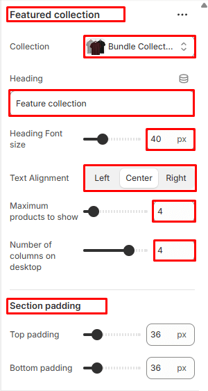
In Sections listing, select Feature Collections
To add new, click to Add section > Feature Collections
Options for each Feature Collections:
- Select Collection
- Heading
- Heading Font Size
- Text Alignment
- Maximum products to show
- Number of columns on desktop
- Section Padding
Feature Collections
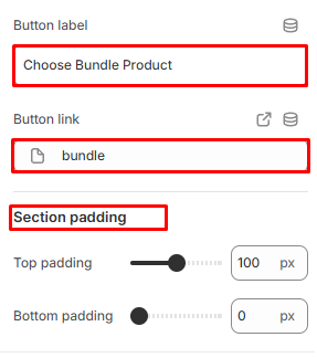
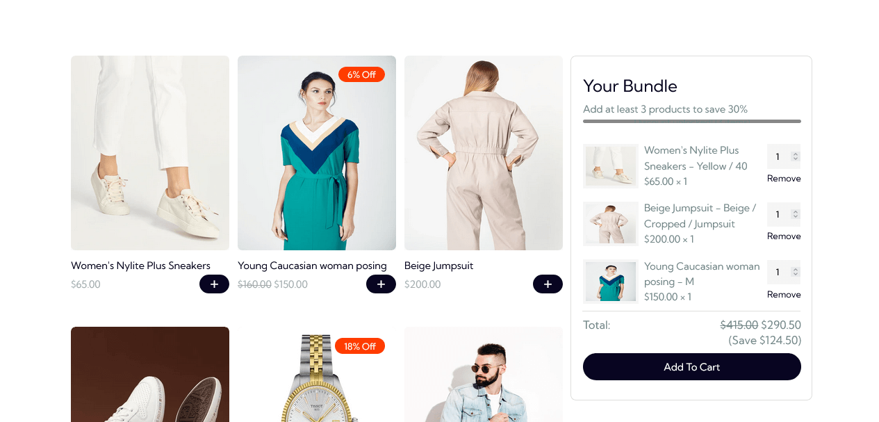
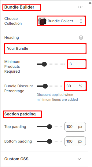
Bundle Builder
In Sections listing, select Bundle Builder
To add new, click to Add section > Bundle Builder
Options for each Bundle Builder:
- Select Collection
- Heading
- Minimum Products Required For Bundle
- Bundle Discount Percentage
- Section Padding
Bundle Builder
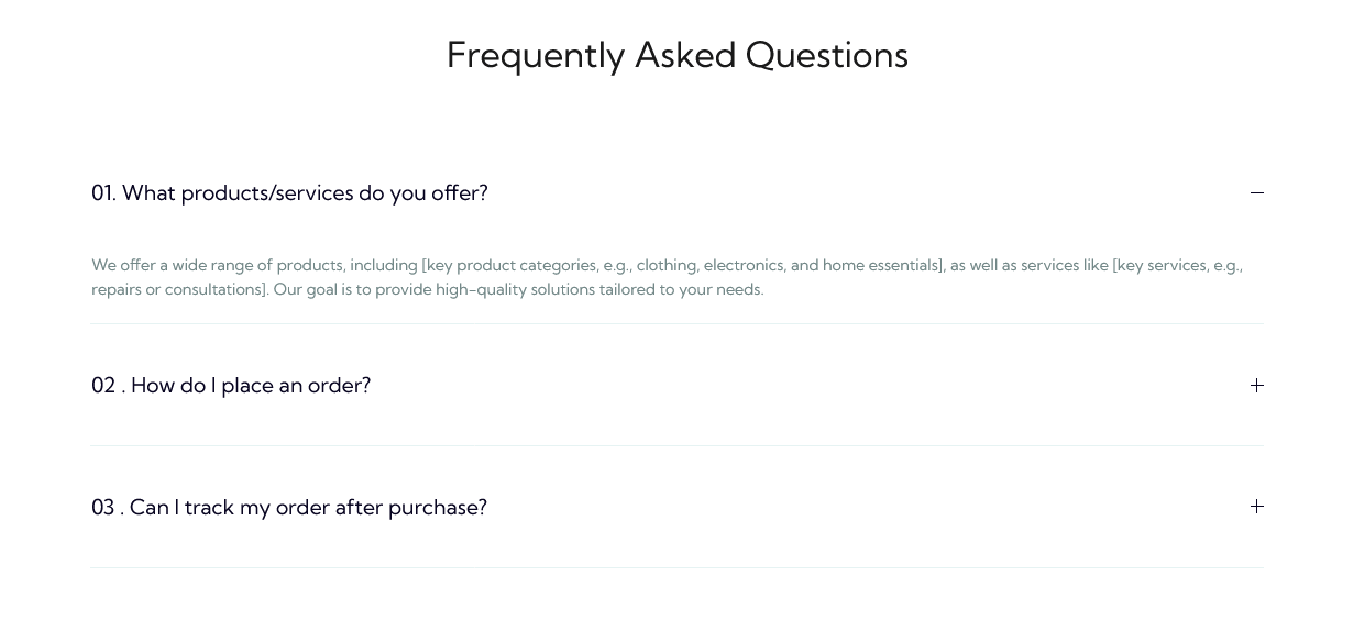
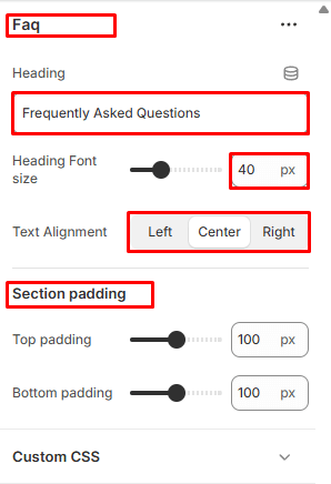
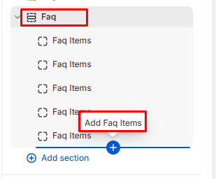
Faq
In Sections listing, select Faq
To add new, click to Add section > Faq
Under Faq Slider section will list options to control the Slide option, click or add slide to control:
Options for each Faq:
- Heading
- Heading Font Size
- Text Alignment
- Section Padding
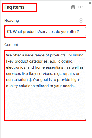
Options for Add Faq Items:
- Heading
- Content
Faq
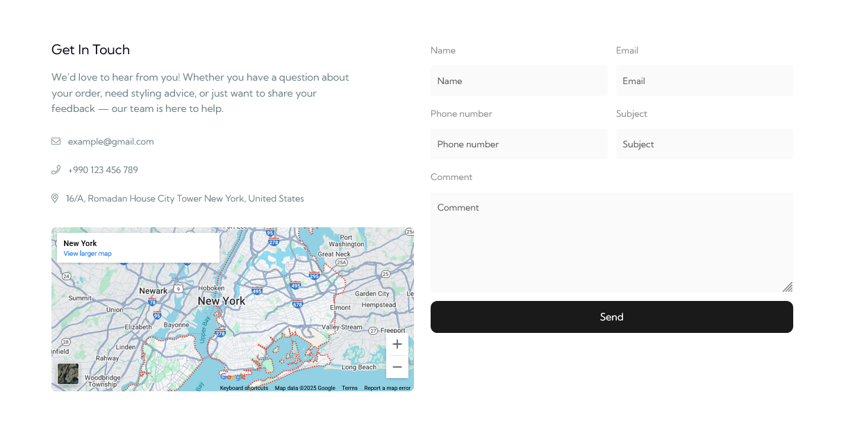
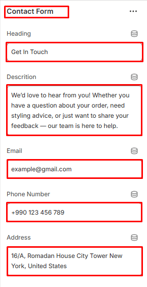
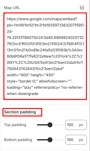
Contact
In Sections listing, select Contact Form
To add new, click to Add section > Contact Form
Options for Contact Form:
- Heading
- Description
- Phone Number
- Address
- Map Url
- Section Padding
Contact Form
About Page
Please log in to your Shopify Dashboard and go to Online Store> Themes > Customize >, these listing of options will appear in the Left area.
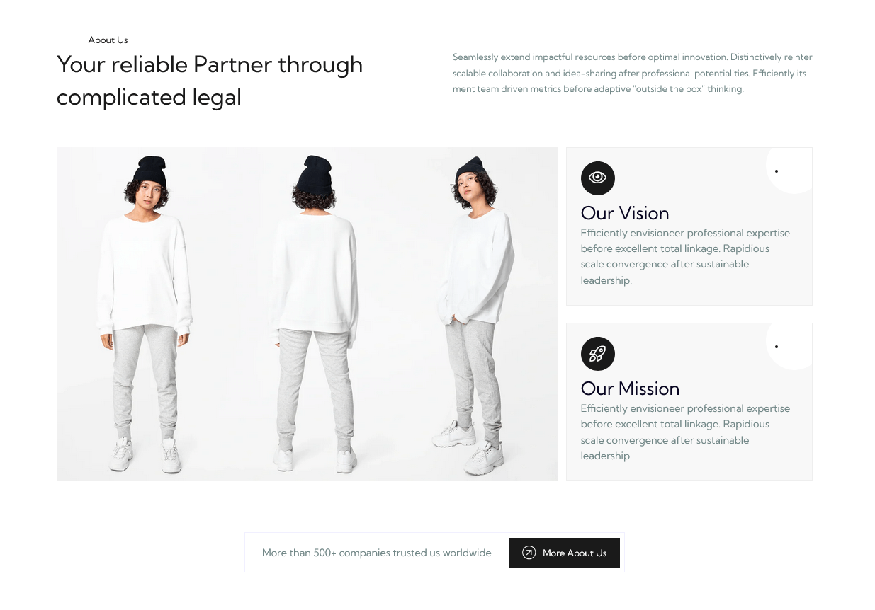
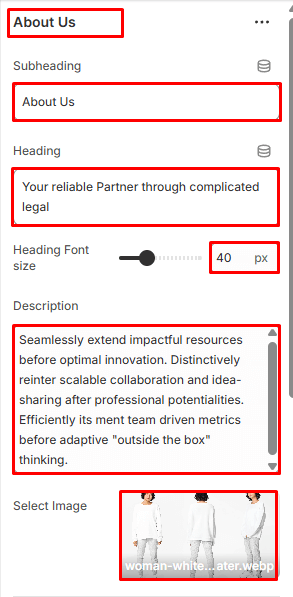
About us
In Sections listing, select About us
To add new, click to Add section > About us
Options for each About us:
- Subheading
- Heading
- Heading Font Size
- Description
- Select Image
- Section Button Text
- Button Label
- Button Link
- Section Padding
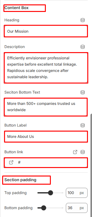
Options for each About us content box:
- Heading
- Description
About us
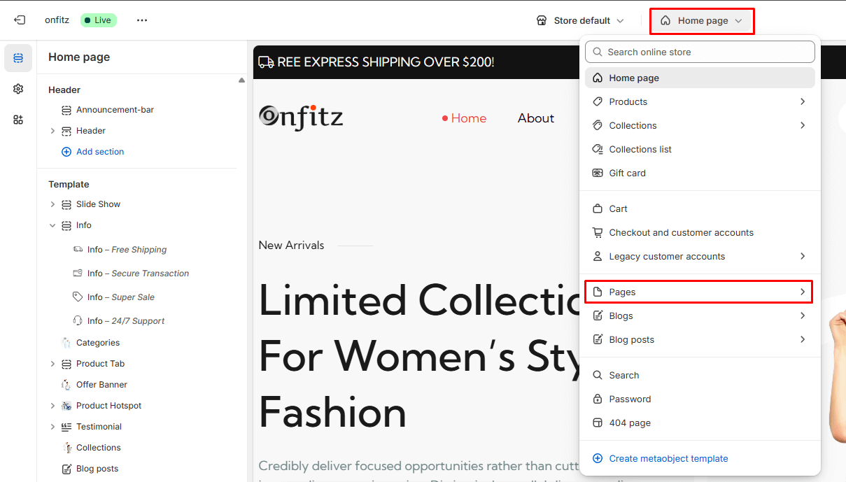
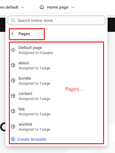
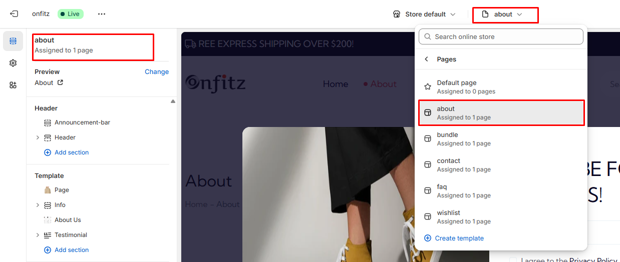
Create Page
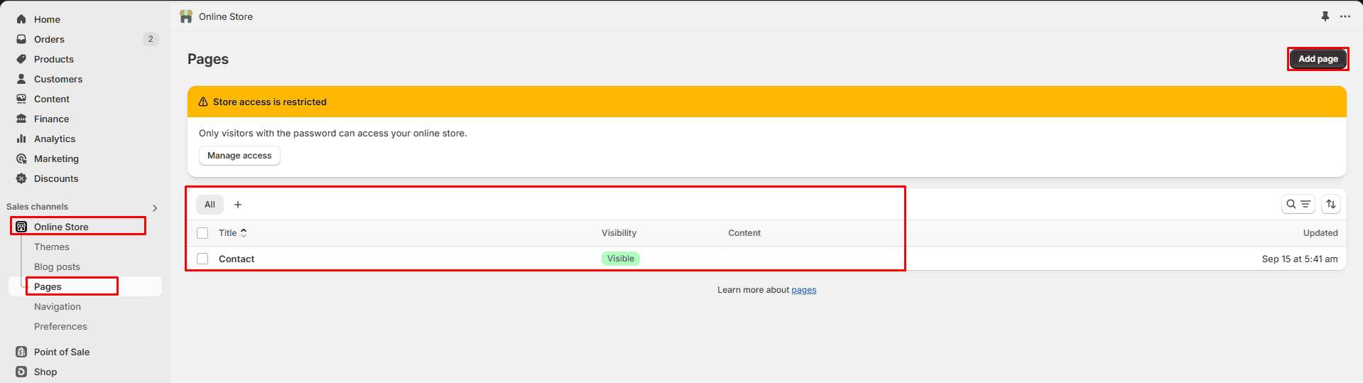
- Create a Page: Log in to Shopify, go to Online Store > Pages > and click Add Page.
- Access Customization: Navigate to Online Store > Themes > Customize to open the theme editor.
- Assign a Template: In the editor, select Pages from the top dropdown and choose a template
- Preview & Edit: Preview the assigned template and customize the page content using the left panel.